Friday, December 14, 2018

Front cover creation

What was the task you were assigned?
The task we were assigned was to create our own Daily Mail front cover and we had to base our creation on one of the past Daily Mail ones.

What programme did you use to complete your task? 
We were assigned to make it on Publisher and in A3 size.

What tools did you use from your programme to create your task ie font websites, crop, colour changes etc?
From Publisher, I used things like: shapes, crop, copy and paste and also font websites.

What were the biggest obstacles to completing your task?
One of the biggest obstacles when completing this work, for me, was trying to keep my creation close to the original idea for a Daily Mail cover. To begin with, I didn't base my creation on any one front cover and I made it up. Therefore, when I started again, I picked a front cover to base my ideas off of and so the outcome was a lot better than it would have originally been. 

Describe your production and why you chose the various text headings and images?

I chose the font of georgia from Publisher as it was fairly similar to the typical font used in the real Daily Mail. More fonts that i used were: Berlin Sans FB Demi, Britannic Bold, Bernard MT Condensed and Calibri. 

What was your initial feedback? What did others say about your production?


Identify what went well and with hindsight what would you do differently?

My written text that I made up went very well as I am an opinionated person and so I found it fairly easy to be able to. However, if I had to do it again, I would focus more on my layout rather than putting too much of my attention onto the information and content that I use. 


THE NEWSPAPER ON THE LEFT HAND SIDE IS THE FRONT COVER THAT I CHOSE TO BASE MY CREATION ON.

Thursday, December 13, 2018

Friday, November 16, 2018

Comparing front covers

Image result for the sun front coverImage result for the guardian front cover

The Sun: 

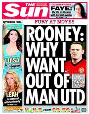
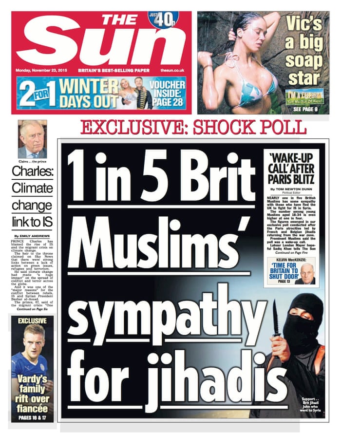
The front cover/main story for this tabloid newspaper is about a famous professional footballer called Wayne Rooney. This story includes the news values of an elite person and also the story is unambiguous.  By using a famous person on the front cover, it appeals to the younger generation, particularly if they are into football.
The intended audience for this newspaper are younger adults/ people of the ages between about 30 and 40. This is because the newspaper includes a large sized sport section as a main story and also there is celebrity news and gossip along the side of the newspaper. Therefore, the older generations may not want to read this because of all of the younger celebs included.
This is quite a negative article because the facial expressions on most of the celebs featured look sad or moody and so this automatically creates a feeling of negativity.


The Guardian:
The front cover/main story for this broadsheet newspaper is about the death of two young children. This story includes the news values of threshold as it is a hard-hitting story which really can affect some people who have experienced the same thing, unexpectedness as it is an abnormal story, negativity as it is not a happy story, personalisation because it includes 'real' people who are involved in the story and finally, proximity because it is quite close to home as it is about a family situation. This broadsheet contains a lot more news values than a tabloid does.
The intended audience for this newspaper is more likely to be people who have a family of their own/older generations. This is because the story is mainly about young children so people who would be affected most by this would be parents who have young children. Also, this newspaper is very informative as there is a larger ratio of text to images rather than a tabloid where there is more pictures.
This is also a fairly negative story. One of the children in the main image has a facial expression of sadness however the other one looks fairly happy as he is smiling. Therefore, you can tell by the negative tone of the headline that this is a negative article.

Image result for daily mail

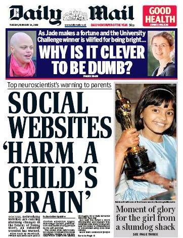
Above is an example of a mid market tabloid. The Daily Mail is a fairly popular newspaper which is neither a tabloid nor a broadsheet.

The front cover/main story of this newspaper is about social websites affecting the brains of children. This story includes the news values of this story is threshold, negativity, proximity and continuity. Continuity is a value in this article as social websites are always being talked about as negative/detrimental for children or anyone.
This is a negative article as it talks about the harming of children and their body parts. By having this as a front cover it makes the audience feel like they want to know the rest of the story and how it has become the front page of a newspaper.


George Gerbner


Image result for george gerbnerGeorge Gerbner argues that exposure to repeated patterns of representation over long periods of time can shape and influence the way in which people perceive the world around them.

Tuesday, November 13, 2018

Online newspapers

Advantages of online newspapers:
> environmentally friendly
> easier to update (live updates)
> larger audience
> more modern
> easy access for some
> don't have to go out to a shop (more practical)
> free (paywalls - Daily Telegraph, The Times)
> your own personal account to choose topics - personalising it
> contact papers quickly
> comments on news stories - audience participation
> easy to share articles
> more interactive - video


Disadvantages of online newspapers:
> holding something - more liked by people
> internet needed
> can't keep the story
> less accessible for the older generations
> more information in the paper
> pop-ups
> long term eye strain
> technical errors


Monday, November 12, 2018

News values

> Threshold - the bigger the impact and reach of the story
> Unexpectedness - an event that is a shock or out of the ordinary
> Negativity - bad news is more interesting 'if it bleeds, it leads'
> Elite persons/places - stories about important people and powerful nations
> Unambiguous - stories that are easy to understand and for papers to report on
> Personalisation - stories that include human interest - 'real' people
> Proximity - stories that are closer to home that are more likely to be included
> Continuity/currency - stories that are already in the news continue to run and are updated

C     U     P     P     T     U     N     E     =     ACRONYM

GUARDIAN and DAILY MIRROR comparison

QUESTIONS
THE GUARDIAN
THE DAILY MIRROR
Who was involved?
Bidhya Sagar Das, the mother who is not named, a witness and twins (1 boy and 1 girl).
Bidhya Sagar Das, Gui Gui (witness), baby boy Gabriel, baby girl Maria and Cristinela Das.
What happened?
Bidhya killed the one-year-old boy with a hammer and his sister was critically injured.
Child dies and his sister is critically injured. Investigators await results of post-mortem exam.
A man has been held over a suspected hammer attack on twin toddlers that killed one and left the other fighting for life.
Where did it happen?
Finsbury Park, North London.
Property in Hackney, North London.
When did it happen?
Saturday 18th March 2017, late on the Saturday. The police were called at 11:10 pm
Saturday 18th March 2017. At 11:10 pm that night, the mum ran into the streets screaming.
Why did it happen?


What do you notice about the difference in content and how the articles convey this information? Why do you think that is?
The article does not go into a lot of depth about why and how the incident happened. There is more information on the witnesses and the later events that weekend. The article also does not include the names of the twins. There is much more text in this article.
There are larger images in this article to make it stand out how children are involved. By using a large image of children, it automatically creates an emotional aspect of the article and the story. Witness quotes are used in the article. Article is more emotional and less informative.

Monday, November 5, 2018

News

Online - The Guardian and Mail websites
Social - Twitter, Instagram and Facebook feeds/comments

Assessment Reflection


HERE ARE THE QUESTIONS AND ALSO THE MARKSCHEME FOR THE ASSESSMENT:


LANGUAGE
With reference to the TV drama poster, answer questions 1-3

Q1: How is media language used to create meaning?
With reference to Media Language – Camera, Mise En Scene, Denotation, Connotation, Layout, Colour, Text
Q2. Who is the target audience and how do you know?
Q3. What are the various readings and interpretations of the advert?

(40)
GENRE
Q4:
What is genre? How does the theorist Steve Neale define genre? What codes and conventions are used to identify genre?
Give examples of media texts to support your answer.
 (25)
  
INDUSTRY
Q5. With reference to the industry you have researched and presented: 
·         How far do you agree with Curran and Seaton's ideas that media concentration generally limits or inhibits variety, creativity and quality?  
·         How have advances in technology affected the distribution and consumption of the media products?
·         How is the media industry you have studied regulated and are there any areas which you think may be hard to enforce?
(35)


MARK SCHEME

Questions 1-3 Media Language (40)
(Comprehensive 28-40, Adequate 18-27, Minimal 1-17, 0 No response or no response worthy of credit)
·         Comprehensive, detailed and accurate application of knowledge and understanding of
Media language to analyse source A.
·         Explaining how the media language fits these conventions, mise en scene to include layout, typography
·         Convincing, perceptive and accurate analysis of representations in Source A, which consistently provides logical connections and a good line of reasoning.
·         Reference to Source is detailed and accurate.
·         Target audience defined by main character, themes, title of programme, genre, channel 4, Sunday night at 9pm (school night). Sponsored by Lexus.
Question 4 Genre (25)
(Comprehensive 17-25, Adequate 10-16, Minimal 1-9, 0 No response or no response worthy of credit)
·         Precise and relevant reference to Steve Neale’s genre theory – repetition and difference / hybrid
·         Comprehensive, detailed and accurate application of knowledge and understanding with media examples of codes and convention of genre (ie. DISTINCT)
Question 5 Industry (35)
(Comprehensive 22-35, Adequate 11-21, Minimal 1-10, 0 No response or no response worthy of credit)
·         A comprehensive response to the set question.
·         A comprehensive and accurate knowledge and understanding of the industry studied
·         Answer is supported by detailed and accurate reference to Curran and Seaton.
·         Clear and precise and balanced explanation of the impact of digitally convergent media platforms on production, distribution and consumption
Cameras, editing techniques, special effects, marketing tricks online, clever campaigns that go viral, cinemas 3D, super screen, IMAX, 4D, screen X for film for eg
Podcasts, social media, interactive websites, comments etc
·         Answer is supported by generally accurate reference to the regulation of industry studied.


ASSESSMENT 1A - GBHS MEDIA STUDIES A LEVEL Marksheet

    Name:      Regan Boyle             Date:             29/10/2018                                       Mark: 62


     AO1: Demonstrate knowledge and understanding of the theoretical framework of media and contexts of media and their influence
     AO2 Apply knowledge and understanding of the theoretical framework of media to:
     Analyse media products/Evaluate academic theories/ Make judgements and draw conclusions
     Level 3

     57+
     A/B 
·         A comprehensive response to the set question
·         Comprehensive and accurate knowledge and understanding
·         Convincing, perceptive and accurate analysis
·         Convincing, perceptive and accurate evaluation
·         Highly developed and accomplished judgements and conclusions
      The response demonstrates a highly developed and detailed line of reasoning which is coherent and logically structured. The information presented is entirely relevant and substantiated.
     Level 2


     40-56
     C/D
·         An adequate response to the set question
·         Adequate and generally accurate knowledge and understanding
·         Adequate and generally successful analysis
·         Adequate and generally successful evaluation
·         Adequate and generally well-reasoned judgements and conclusions

      The response demonstrates a line of reasoning with some structure. The information presented is in the most part relevant and supported by some evidence.

     Level 1

     Up to 40
     D/U
·         A minimal response to the set question
·         Minimal application of knowledge and understanding
·         Analysis is minimal and/or largely descriptive and may not be relevant
·         Evaluation is minimal or brief, and is likely to be largely descriptive
·         Judgements and conclusions, if present, are minimal with limited support
·          
      Information presented is basic and may be ambiguous or unstructured. The information is supported by limited evidence.


      Identify a strength or strengths in your assessment:
      I did well when answering the whole section on media language because out of the possible 40 marks on those 3 questions, I got 36. Therefore, I only lost 4 marks on this section. I think that this is because a lot more time was spent on media language and I found it more interesting to learn (especially as it was the first thing large topic that I learnt when being introduced to A – Level Media).

     What are the areas you need to improve?
      I need to improve my knowledge on the theorists because I knew that Steve Neale was to do with genre but I didn’t remember anything else about him.

     What do you need to focus on for your next assessment?
      I need to focus more on the theorists and also the industry as they were my weaker aspects of the assessment.


Friday, November 2, 2018

Representation

Dominant ideology: 
> Ruled by middle class, white male, straight, Christian
> Stereotypical

Stereotypes: 
> Media industries use stereotypes because the audience will instantly understand them
> Think of stereotypes as a 'visual shortcut'
> They're repeated so often that we assume that they are normal or even true

Archetypes: 
> This is the 'ultimate' stereotype
> For example: the white, stiletto wearing, big busted, brainless, blonde bimbo

Countertypes: 
> A representation that challenges traditional stereotypes associations of groups or people

Representation: 
> The way in which people, events and ideas are presented to the audience
> So, the media takes something that's already there and represents it to us in a way that they chose
> These representations are created by the producers of media texts

Stuart Hall

He was looking into mass media and also the power of how media can represent DRCAGES. DRCAGES stands for:

D - disability
R - regional identity
C - class
A - age
G - gender
E - ethnicity
S - sexuality

Oppositional, negotiated and preferred readings.

Examples of these influences in media:

Statement: "This drink is the best drink in the world, you'll love it!"
Oppositional: "No, I definitely won't love this drink at all!"
Negotiated: "This drink might be one of the best drinks in the world!"
Preferred reading: "This drink is definitely the best drink in the world!"

Preferred reading is what producers want you to believe.

Friday, October 19, 2018

Own TV Advert

Our advert is: Sports drinks for women over 50.

Starting notes for our advert:
> Netball courts
> Teachers playing netball?
> Drink - close up of it to see the label
> Louis = making the music for the advert
> Show product at the end of the advert as well as throughout
> Light blue and lime green logo
> Regan (me) shooting = young teacher
> Natural lighting = outside
> People doing exercise/moving in the background (blurred) with the product next to a netball (in focus) - low angle
> Teacher wearing darker clothes and when it switches to Regan, brighter clothes are worn to show youth
> "Be young, be free, be healthy!" = slogan


EVALUATION: 

The task that we were given was to create an advert based on a sports drink for women over 50. The name of our brand was REFUEL. We tried to sell the product by showing an older woman holding the product and then turning into a younger and quicker woman.
I worked with Maisie, Daisy and Ami. Filming was mainly on Ami as we were using her camera and iPad. Planning was all of us but I came up with the general idea for the advert. Maisie and Daisy both did some research for the advert. Ami made the logo with her iPad for our sports drink. Daisy dedicated herself as the "director" and Maisie got a lot of the props included in the advert.
We planned our filming by focusing firstly on the easier and shorter shots. For example, we started by filming Mrs Cooper as she is a teacher and has a busy schedule so we based a lot of the filming around when she was free as well as all of us.
We planned our advert the first day we found out what it would be based on and we developed the ideas as time went on.
Initially, we were going to make a harder advert to film however, we didn't have a lot of time to complete the advert so we had to change our plans. Our sequence wasn't as successful as we originally thought but we had to change everything based around what we had and how long we had to do it.
What went well was our different ideas about the camera angles. movements and shots throughout the advert. Also, we managed well to incorporate everyone in the group into the visual aspect of the advert. However, we could have worked a lot quicker in the organisation and preparation of the advert as we were discussing everything longer than we spent filming.
From this task ,we have learnt teamwork skills and how to handle everyone's different perspectives and opinions on certain things. Our communication improved the longer we spent on our advert and we did have to compromise quite a lot due to different hurdles during the production.
In future products, what we have learnt from this will be useful as we can plan a lot quicker and dedicate more time to the actual filming and editing of the advert. Communication is very important and so now having the extra knowledge that we didn't have before, we will be able to make a more successful advert.

Friday, October 12, 2018

Audience

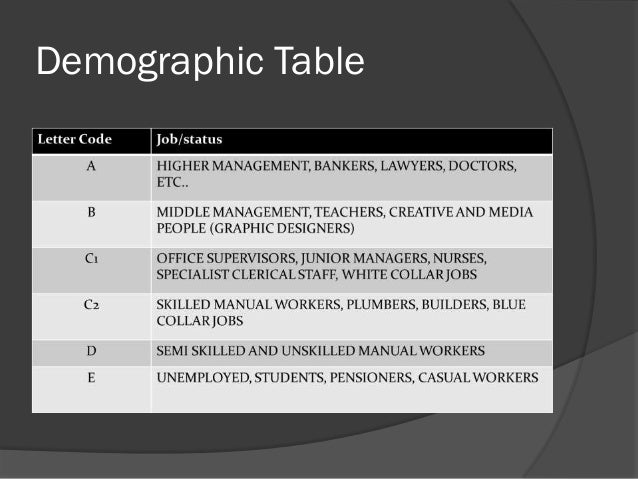
DEMOGRAPHIC PROFILING:
In order of job status, includes money etc.

Image result for demographic profiling table media


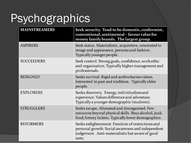
PSYCHOGRAPHIC PROFILING:
mainstreamers - seek security.
aspirers - seek status.
succeeders - seek control.
resigned - seek survival.
explorers - seek discovery.
strugglers - seek escape.
reformers - seek enlightenment.

(as we go up this list, materialism increases)

Image result for psychographic profiling table media

TARGET AUDIENCE vs NICHE AUDIENCE

Target audience - females/males etc.
Niche audience - targeting a very specific audience.


Fruitella Advert

Media Industries

  • Brand identity: The image that a company makes for itself through the use of things like logos, slogans and other marketing tools in order to appeal to people/an audience.
  • Cross-platform: The appearance of a media text on more than one platform; cross-platform or cross-media advertising is used to market a product like a film on the web, TV and newspapers.

  • Endorsement: The act of supporting or backing something; celebrity endorsement is often used in advertising to sell a product.

  • Ethos: The purpose, attitude and beliefs of a person or an organisation.

  • Media convergence: When audiences use one platform to consume various types of media texts.

  • Media format: A media format refers to whether the content is video, audio, print based, or a combination such as a website or video game.

  • Media platform: A media platform is where a media text is presented; this can be TV, cinema, computer, games console, digital media player, smartphone, tablet, magazine, or newspaper.

  • Media text: Any media product such as a TV programme, film, magazine, video game, newspaper, music track or album created for an audience.

  • Niche audience: A small, narrow audience interested in a specific topic or theme (the opposite of a mass market audience).

  • Public service broadcasting: Public service broadcasting is for the benefit of the public and not just for profit or commercial gain; the BBC is a public service broadcaster in the UK.

  • Smartphone: A mobile phone with a powerful processor that is capable of running applications and accessing the internet.

  • Tablet: A computer device a little smaller than a laptop but with a built-in touchscreen, usually without a keyboard.
The media industry can be defined as a varied collection of organisations that share the production, ,publication and distribution of media texts.  

Media organisations include:
> BBC
> Disney
> News Corp
> Nintendo
> Marvel
> The Guardian

Media texts can be used to inform, entertain or promote ideas/products. 

'Traditional media' or 'old media' are the names given to the industries that existed before the internet. For example, radio, print and television. 

New media includes:
> Websites
> Blogs
> Vlogs
> Online games
> Podcasts
> Apps


Tuesday, October 2, 2018

Mise En Scene

Mise En Scene

(put in scene)(place on stage)

Costume - can signify certain individuals, can show time period etc.
Lighting - high, medium, low etc.
Actors - movements, blocking, positioning, expressions etc.
Makeup - to make someone look older or younger
Props - weapons, items etc.
Setting - external, internal, weather, daylight, month, time etc.

Some notes from the lesson:

> set dressing
> texture
> lighting is important for movies
> 3 point lighting - fill, key, back
> high key/low key lighting
> highlights/shadows
> chiaroscuro
> hard lighting/soft lighting
> mood (of scene)
> ambient lighting
> unmotivated lighting/motivated lighting
> natural lighting
> colour - black/white = cheaper
> tinting - sepia tone = dusty
> colour grading - adjusts saturation
> colour palette
> space (within the frame) - balance, shallow space, off screen space
> different types of space (e.g. linear, asymmetric, round etc.)


Powered by emaze

Ghost Ship


GENRE

DI: The movie begins with a romantic setting of many couples on a cruise and everyone enjoying themselves. There is a female singer in a flamboyant red dress singing to all o the cruise and her voice is being projected all over the ship using speakers. Set in 1962 - Italian ocean liner.

S: The setting is a large, expensive cruise ship floating on the ocean during the night/evening time.

T: The opening scene of the movie seems to be a romantic theme however once the music begins to change and the camera scenes change, the theme turns to horror. Also sadness is shown.

I: There are many props throughout this opening scene. For example: a microphone and stage for the singer to show how expensive this cruise is, tables with luxurious food and candles on them to show how this cruise has many rich/wealthy people aboard, a game that the little girl is playing with, clean and white sailor hats to show the professional side to the sailors but most importantly, there is a long metal wire as a prop. This metal wire is a significant prop as it is the prop that makes the audience concerned once the music begins to fade/change.

N: The story is told throughout the length of the song that the female in the red dress is singing. At the beginning of the song, the camera angles and movement show how everyone is enjoying themselves and they all look fairly wealthy and of a high status. However, nearer the middle/end of the song, it shows how the dances are coming to an end, almost like everyone's lives as very soon after, most of the people aboard the ship die from being sliced in half by a metal wire.

C: There are many characters during these opening scenes however, the camera focuses a lot on two characters that some may presume are main characters. The female singer in the red dress has a lot of screen time in the opening scene as well as the young girl all dressed up. Due to this much screen time, attention is drawn to the young girl and how she acts before and after the deaths of hundreds of people right in front of her eyes.

T: The camera quality has an added effect on it to make it look like it is in the olden days (1962). Furthermore, long shots have been used a lot to emphasise the mass of wealth aboard the very large cruise ship.


MISE EN SCENE

C: Formal suits and dresses are the main costumes other than clean, white sailor suits.

L: The lighting is unsaturated and romantic looking to show the current mood of the atmosphere.

A: Everyone in the opening scene are full grown adults with the exception of the young girl who begins by sitting on her own playing.

M: There is only makeup on the women and the singer to show the maturity and femininity of the females on board.

P: There are a lot of flowers spread around the cruise creating the image of nature and beauty which completely contradicts how their is later death and blood everywhere.

S: The setting is on a large cruise ship. The exterior of the boat is shown and also the interior is shown as very flamboyant and elegant by the mass of camera angles.


SOUND

M: The music begins very soft and elegant however it then turns to more dramatic.

C: The music is parallel throughout the opening scene as everyone is happy when the music is soft but when the music begins to change, so does the mood of the atmosphere on the ship.

D: The sound begins as diegetic as the singer sings however, it turns to non diegetic when the deaths occur.

O: There is a lot of both offscreen and onscreen. There is a lot of offscreen sound when there is a large pan of the cruise ship's exterior and the woman is still heard singing however, there are also scenes where the woman is in the scene and you can visually see her singing.

V: There are no voiceovers.

E: The sound creates the emotions of love, sadness, shock and horror.

D: There is a lack of dialogue to emphasise how the audience should be watching the movements throughout each scene and so when the wire is shown, it allows them to focus on the visual rather than the verbal.


EDITING

S: The singer and the young girl have the most screentime which could imply that these are the main/important characters.

T: There are smooth transitions through to each scene to represent how the evening is/was going smoothly.

O: The order of narrative is in chronological order as all of the events that happen on the screen happen in that order.

P: There is a slow pace throughout which is ambiguous as it could represent the age of the people there as they cannot move as fast as a younger person or it could represent the slow flow of the ocean beneath them.

S: There are no added special effects however the camera does zoom into the metal wire to create an idea of importance.


Boys In The Hood

GENRE

DI: There are kids walking along the sidewalk in a rough neighborhood and they come across a crime scene. Then they get to school and Tre gets up and teaches the class with his superior knowledge compared to the rest of the class. There are strays all around the neighborhood also.

S: The setting is in 1984 in a fairly poor neighborhood/school.

T: The themes are violence and corruption.

I: The props include the teachers stick and also police tape showing the time period and the corruption in the neighborhood.

N: There is no narrative.

C: The young boy is shown as the main character.

T: A low angle is used for Tre when he is peaking to show his superior knowledge compared to all of the other students in his class and so a high angle i used when the dialogue of the other students occur.


MISE EN SCENE

C: As soon as the opening scene begins, Tre (the young boy) is wearing very smart and formal clothes, further emphasising his intelligence and maturity. The rest of the kids around him are wearing typical colourful, children's clothes to match their age and lack of maturity compared to Tre. Tre's mother is wearing a very formal outfit, suggesting how how her lifestyle is of a middle/maybe high class. This contrasts with how Tre's teacher was talking down to her on the phone.

L: All of the lighting used in the opening scene is natural lighting to show the normality of the children walking and being at school. However, there is also a bit of high key lighting used.

A: You can see that the main character is Tre and his friends.

M: There is no specific makeup being used to create anything. However, the mother of Tre is wearing makeup to symbolise her age and maturity.

P: Whilst the kids are walking to school and looking at a crime scene, there are posters of the president with bullet holes covering them. This has been done to signify the violence and also hate that the people in the neighborhood feel towards the president. Furthermore, at school, the teacher uses a stick at the front of the class as a pointer etc. so this represents the time period as nowadays we would have laser pens/remotes.

S: The setting is in a rough neighborhood where scenes include the sidewalks and school that the young children attend. The use of the downtown alleys with kids in them are used to show how there are many places where things could go wrong e.g. shootings.


SOUND

M: Soft, investigative music is used in the beginning when the kids are walking however the music changes to create tension when the kids are "investigating" the crime scene.

C: The music is parallel to the kids on their way to school because they begin by being chilled walking and then they decide to investigate an alley.

D: Diegetic sounds are heard in the beginning, like animal noises and police cars/sirens.

O: Offscreen, noises like: older men shouting, cars, gun shots, planes, helicopters, police and screams can be heard. Onscreen, you can see the teacher and students talking to each other in the school.

V: There are no voiceovers.

E: The sound creates emotions of fear, worry and possibly confusion.

D: The dialogue sued by the teacher, mother and kids all mean something different. The kids' dialogue on their way to school is talking about very advanced things that normal kids wouldn't talk abut. The teacher's dialogue is used to emphasise how smart Tre is and the mother's dialogue is used to show her responsibility and maturity (even when she the teacher is being rude to her).


EDITING

S: The most screentime is covered by the young group of children, however, the young boy Tre has the most screentime to emphasise his main part in the movie.

T: There are no transitions, they are just straight cuts to different scenes.

O: The order of narrative is chronological.

P: There is no change of pace in the editing, all scenes are the natural pace of how they were filmed.

S: Special effects in the opening scene include the gunshots when the screen is black. This emphasises the rough neighborhood.


Jean Baudrillard - Post Modernism theory + application of usefulness

Baudrillard's theory: - The idea that in postmodern culture, the boundaries between the 'real' world and the world of the medi...